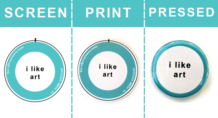
Here at Busy Beaver, we hold ourselves to the highest button quality standard. We work hard to make our customers the highest quality buttons, provide friendly and helpful assistance, all at a great price. This means making sure that the button design you imagine looks just like the button you'll hold in your hand. While our complimentary digital proofing process shows you how your design will lay on the face of your button, it is not a true portrayal of how your colors may print. Some common reasons for that difference between digital proofs and printed buttons are RGB screen colors displays vs. our CMYK printing process, special finishes, and our mylar coating.
Want to learn more? Don't worry: Busy Beaver is here to help explain why designs may look different on your screen than on the your printed button!
RGB and CMYK—What Does it mean?
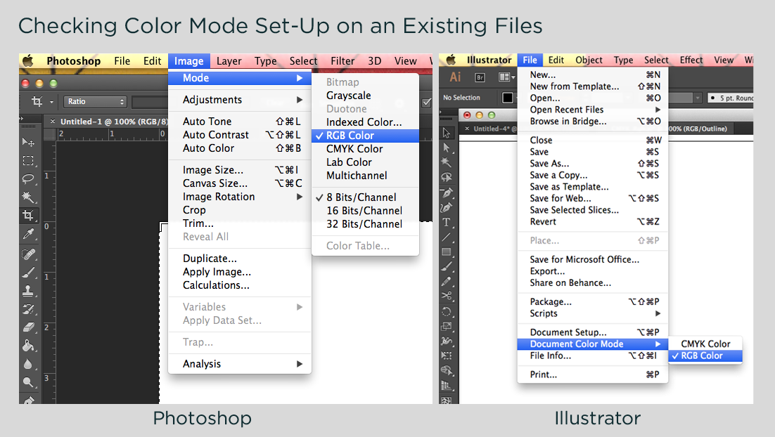
Let's start with the two types of color profiles that can be used during the design process. Any artwork that is meant to live on a screen, (i.e. a website infographic) must be in the color mode RGB. Designs that are meant to be printed (i.e. books, business cards, or buttons) must be in the color mode CMYK. Find out more information about setting up your file in RGB vs. CMYK over here.
Let's define what
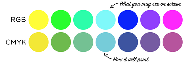
RGB is and how we use it everyday. RGB (Red, Green, Blue) is an additive color profile, which means the sum of all the colors combined creates what our eyes see as white. If you're viewing your design on any device with a screen (including your phone, laptop, computer monitor, television, or tablet) you'll see it represented by an RGB color profile. Any shade of red, green, or blue that is represented on your computer or television screen is made up of tiny pixels that are labeled with a number between 0-255.
Keep in mind: screens are calibrated differently, so the colors you see on your phone may not be the same colors you see on your desktop computer, even if the design is identical.
The color mode for printed materials is CMYK (Cyan, Magenta, Yellow, and Black). Unlike RGB, CMYK is a subtractive color profile, meaning that the color white is achieved when colors are reduced or taken away from the final product. You can think of this color mode a lot like painting in school; the more colors you add, the darker it gets. All the CMYK color values are described on a percentage scale from 0-100. A CMYK printer produces these shades using a process called half-toning, in which small dots are combined to make the colors we see on paper.
Why Don't My Buttons Look Like How They Did on Screen?
There are a couple of reasons the colors on your screen may differ from the colors on your buttons.
- Design file was submitted as RGB
Artwork prints best if it's designed in the CMYK color mode. If your design was made in RGB, our design department will convert the colors to CMYK for print. When you convert RGB to CMYK, some colors convert with no visible difference, while others could look less bright, or lack contrast. - A computer screen will always look brighter
If you notice a decrease in your design's contrast when printed, remember that on-screen images have light shining through them, which causes images to appear more bright and vibrant. Printed artwork's brightness depends on the contrast between printed colors and the white of the paper. Keep this in mind when adjusting the contrast and brightness of your button artwork before print. In general, brighter and higher-contrast is better!
- You've chosen a special finish
When designing for special finishes, remember that the white in your design will be replaced by the color or design of the special finish paper you've chosen. For our glow-in-the-dark, metallic, sparkle, and cosmic special finishes, your artwork is first printed on a clear sheet, which lays over the special finish paper. Finishes like sparkle and cosmic have particularly busy backgrounds. To make sure your design stands out against the shine of the paper, it is important to keep your artwork bold. Our metallic finish uses the metal of the button as a base. This gives your button design a great texture, but can also darken its appearance. The same is true of our neon, paper bag, metallic gold paper, and metallic silver paper options. Printing a colorful design onto these papers will cause the colors to appear darker. - The protective mylar coating
All of our custom products (including our buttons, magnets, mirrors, and bottle openers) are covered in a layer of mylar to protect your artwork. This layer of polyester film, though thin, could also result in a slight darkening of your artwork once pressed into a button.
How Can I Make Sure the Right Colors are Printed?
Our staff is happy to troubleshoot these color obstacles with you. If you have a Pantone color swatch handy, feel free to include it in the notes of your order, and we'll happily hand-match our print out to your desired Pantone Colors.
The sure-fire way to see what your button will look like printed and pressed, is always to request a physical sample.
It's easy: just email Customer Service about getting your sample order into the system, and we'll hook you up for $5 per design!
Let's Review!
- When designing for any form of print, change your file to CMYK color mode.
- Compared to how they're displayed on your screen, printed colors may appear dull or low contrast.
- To ensure that colors are exactly how you envision them, feel free to include Pantone Colors for our designer to match to, or...
- Request a physical proof to review before placing your full order.
Have questions or concerns about your order? Reach out to orders@busybeaver.net before or during your order process. We're here to help make the best buttons for you and your team!