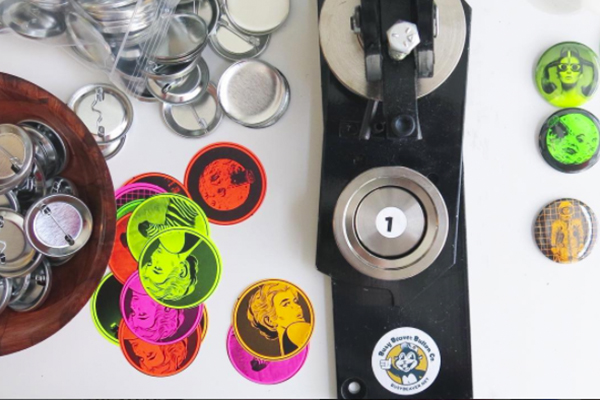
Ready to get bright? The Neon Finish is Busy Beaver's most vibrant and colorful special finish, and it's perfect for adding some major pop to your designs! With neon, your black and white artwork is transformed into a mix of five super bright colors on buttons, magnets, bottle openers or mirrors.
Since Neon is different from any of the other finishes we offer, you may be wondering how well it will work with your artwork. Read on for six quick tips to pairing artwork with the Neon Finish and creating designs that look their fluorescent best!
1. Black and White
Remember that the Neon finish works best for custom pins with black designs, so be sure that the image you plan to use is already set up as black and white. Although it's not recommended to use full color images because the colored paper distorts the look of color ink—why not get a little creative and request a physical proof for this type of personalized buttons?
If you've got a color image that you want to turn black and white, keep in mind most image editing programs will allow you to convert to black and white or grayscale.
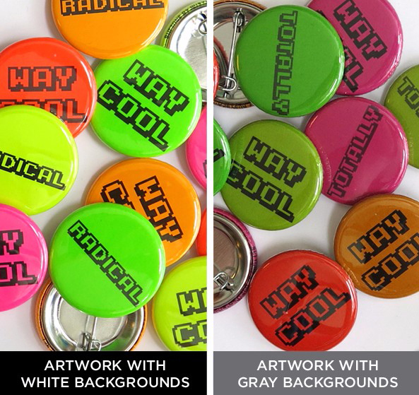
2. Go Bold
The best designs for the Neon finish are generally very bold black and white designs. Dark grays and blacks look super cool contrasted against the five fluorescent paper colors.
Shades of gray will add a dulling-effect to the look of the neon custom pinbacks. To take full advantage of how bright these colors are, we suggest using a design with plenty of white space.
3. Nice and Simple
Think your design is too simple to make an interesting button? The color pop of the Neon can transform even the simplest design into something unmissable. Single words, graphic logos, and simple graphics look great on the mix of bright backgrounds.
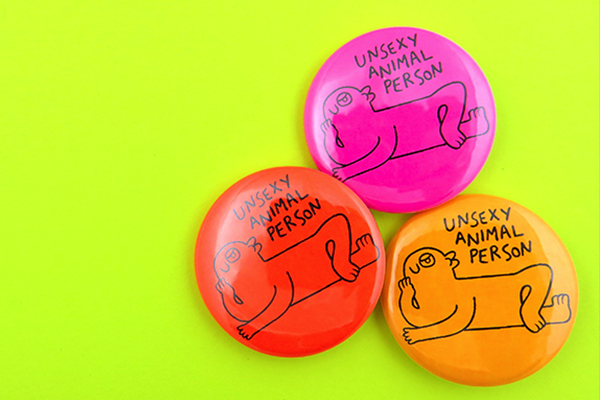
Cartoonist Miranda Harmon decided to use one of her favorite doodles to forever be remembered and passed out in the form of a neon button. Now everyone knows the kind of unsexy animal person you are!
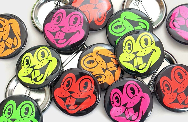
4. Make it Pop
When planning a design for Neon, remember that it's the white areas of your design that will appear as the bright background colors. Consider whether you want the fluorescent shade to be the main color of the image, or appear as a "pop" against a darker black background. Both can be really effective-- it all depends on the look you're going for. Try inverting your image to see which makes the most impact, or order both versions!
5. It's a Rainbow
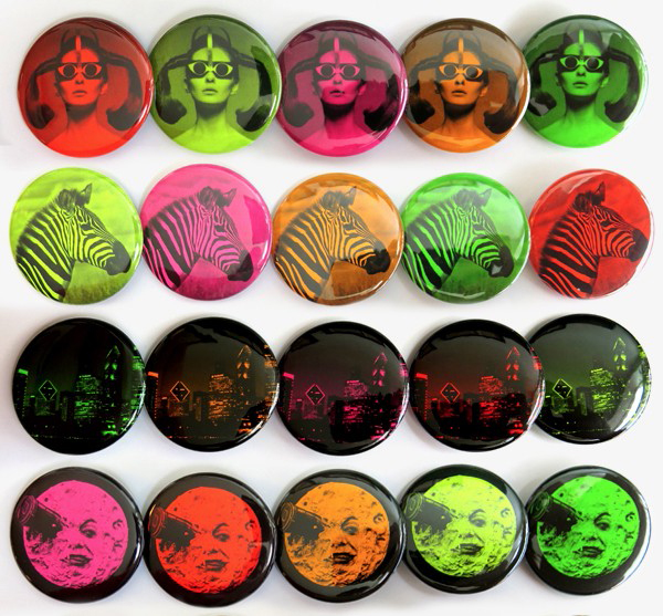
Don't forget that the Neon Finish includes a mix of five fluorescent background colors. For every other special finish or paper color option we offer, different background colors are considered different run of buttons and pins, but with the Neon finish you get bulk pricing for all five background colors! Since it comes as a mix, consider how your design will look on all five background colors-- yellow, green, pink, light orange and dark orange.
6. Mix and Match with other finishes!
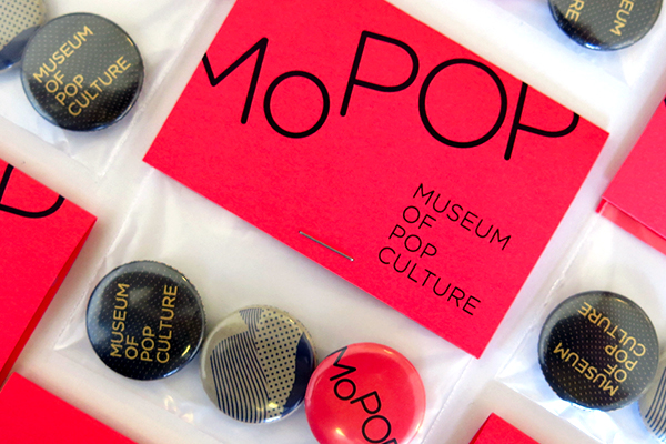
While the Neon paper looks great with all the colors of the rainbow on one design, try mixing and matching this colorful finish with one of our other popular draws. Check out this bag and topper button pack from MoPop in Seattle. They added the extra creative flair by using the neon finish for their button and packaging, along with our paper bag finish to create a lot of great textures in their souvenir.
7. Take a Risk
If a bright, neon rainbow background isn't the perfect excuse to try something a little crazy, we don't know what is! Think outside the box to try out artwork that nobody would expect to be paired with a fluorescent background. Maybe most photos would look a little odd paired with neon, but that doesn't mean you don't have one that's the exception. How about a fluorescent skyline, or bright colored zebra, like the ones pictured above.
Try something new and make your own buttons today!