

When you're new to print design, color can suddenly feel a bit overwhelming. What used to be as simple as ROY G. BIV now has lots of strange acronyms and new terms floating around-- RGB? CMYK? Spot colors? Pantone? What does it all mean?! Luckily, getting a basic knowledge of print color doesn't have to be complicated. With a couple definitions and a few quick tips, we've got the info you need to design the color button of your dreams!
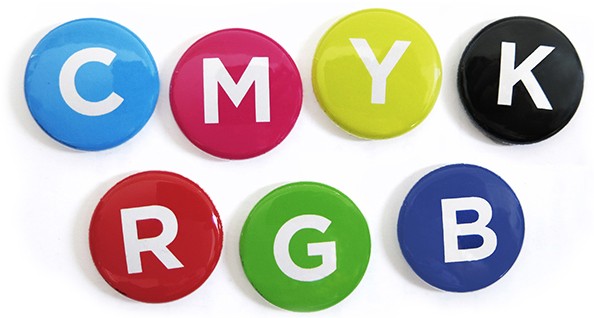
What is CMYK and RGB?
There are two color modes, or systems, for displaying color that you need be familiar with when working in digital design and print:
RGB: RGB stands for Red, Green, Blue, and is the color mode that digital screens (computer monitors, smart phones, etc) use to display color. Screen images combine red, green and blue light to create millions of possible colors, from soft pastels to bright neons.
CMYK Printing: CMYK stands for Cyan, Magenta, Yellow and Black, the ink colors used in the 4-color print process. Busy Beaver uses a CMYK printer, so products we print will be produced in CMYK color. CMYK printing is economical and has a broad range of colors possible. It is important to note, though, that some super saturated colors you can see in your RGB art file may not be possible to achieve if you convert RGB to CMYK.
How do Color Modes Apply to the Design Process?
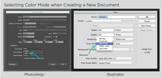
As mentioned above, at Busy Beaver we print CMYK with our 4-color printing process. To get the closest match possible between what you see when designing on screen and what will actually print, it's best to design your artwork in a file set up in CMYK color mode. The screenshots below show you how to set up a new Photoshop or Illustrator document in CMYK for print. You can also design directly in our button templates, which are already set up and ready to go in CMYK.
If you have a design already created, you may want to check and see what color mode it was set up in originally. The screenshots below show how to look this up in Photoshop or Illustrator, and it's possible to find color mode information in most design and image viewing programs.
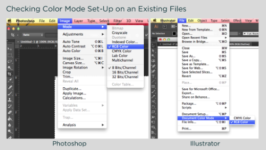
If your file is already in CMYK, then you're all set-- the image should print closely to what you already see on screen. If the file was created in RGB, you may want to convert it to CMYK to get a feel for how it will look when printed in CMYK.
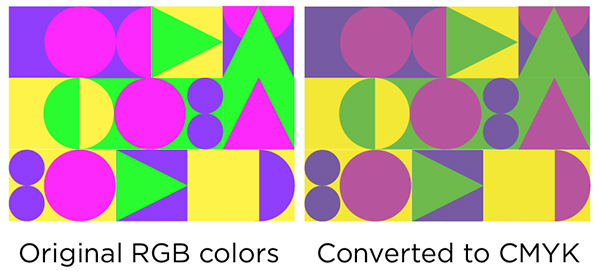
Color Changes Between RGB and CMYK
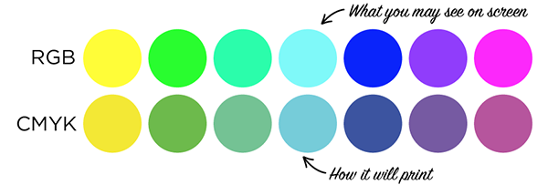
It's helpful to design print images in CMYK color mode because there are certain RGB colors that can't be replicated in CMYK printing. The term "color shifts" refers to changes in how a color appears. These shifts can happen when switching from one color mode to another, and from screen to print.
Some super saturated RGB colors will appear more muted when printed in CMYK (see examples below). In addition, since every device will preview colors a little differently, there can be some color shift from screen to print even if your document is set up as CMYK.
If you submit artwork in RGB mode, the images will automatically be converted to CMYK when printed. Converting an existing file will dull the color more than if you had created it in CMYK mode to begin with (another reason why starting in CMYK mode is a good idea when designing for print).
Also keep in mind that if you have requested a digital proof, those files will also be sent in a CMYK color mode that you'll be viewing in a RGB format. Those colors may also look askew if viewed on your computer or mobile device.
Extra Credit: Pantone Matching System (PMS)
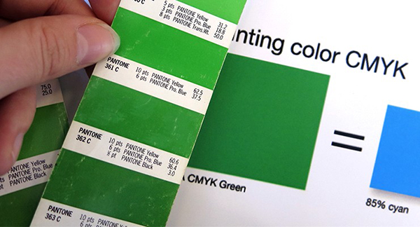
PMS colors, or Pantone Matching System colors, were created to be the standard in color matching for designers. The difference from Pantone to CMYK is the amounts of screens (or shades of a color) used in the final product. Pantone colors print from an off-set printer and can be replicated with an exact one-color formula while CMYK is a mixture of cyan, magenta, yellow, and black that can possibly vary from printer to printer. This variable in coloring from printer to printer is why most artists and designers send the uncoated Pantone Colors that their design is meant to match. Pantone does a great job at explaining the difference from spot colors to process colors.
A lot of the commercial world (as well as Busy Beaver) uses a 4-color process printer (CMYK printer) instead of an off-set printer, but will ask if you have a Pantone Color that you'd like to match your design with. In order for us to match the green in your design we'll print out a sample and physically match the color printed with our handy Pantone Matching Booklet. To help in this color matching, we'll need your original artwork to be vectorized to easily adjust the shade if needed and the Uncoated Pantone Color you're wishing to match it to.
If you do have questions about how a color will turn out on your finished item, requesting a physical sample will allow you to check out the color in person before placing your entire order. Contact us for info on having a sample made. If you want a little more help, the talented designers in our Design Studio is ready for you!
So to recap— keep the RGB designs for websites and social media, and design in CMYK when you're creating something to print. If you have a question about how an existing file was created, use the steps above to check its color mode before placing your order or, if all else fails, get in touch and we're happy to help as well!