

Designing for buttons seems pretty straight forward-- You just make it round (or square, or rectangular) and we print it out and press it, right? It's not actually a whole lot more complicated than that, but just like any medium, there are specific tips and tricks that can make a good button design even better. Processing hundreds of orders a month, our designer, Natalie, is the foremost expert when it comes to great button layouts. Here are her top three button-specific layout tips to keep in mind when putting together your design.
1. Avoid Borders
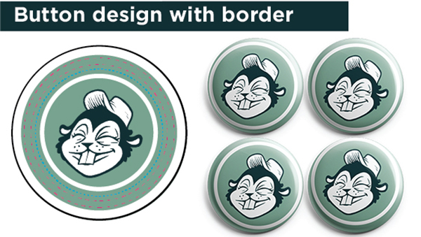
Did you know that each of our buttons is cut and pressed by hand? We love that human, handmade element that makes each one unique. That said, since there's no perfectly precise robot overseeing production, some slight shifting can occur in how artwork is centered on the finished button. Even a tiny 1/16" of an inch shift on something as small as a button can leave it looking a little off. Natalie recommends that "although it is tempting to put a border around your artwork, especially on round buttons, I generally try to stay away from it. Tiny imperfections in how the button has been cut and pressed are usually not noticeable but with a border you're more likely to see that artwork isn't perfectly centered."
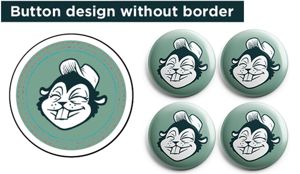
For best results: Leave the borders for print projects, not buttons.
2. Add Bleed
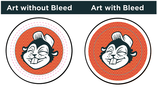
"Pretty much every button looks best when bleed is included," Natalie said. Adding bleed to your artwork will go a long way toward giving the finished button nice, seamless look. When you design ends right at the face of the button (artwork that's exactly 1" for a 1" button, for example), the edges that wrap around the button will be plain white and then, like the borders mentioned above, slight shifts become much more apparent. Adding a bleed that matches your design camouflage those. Natalie added that "the templates available on our site show exactly where the button face ends, making it easy to set up your artwork to include bleed."
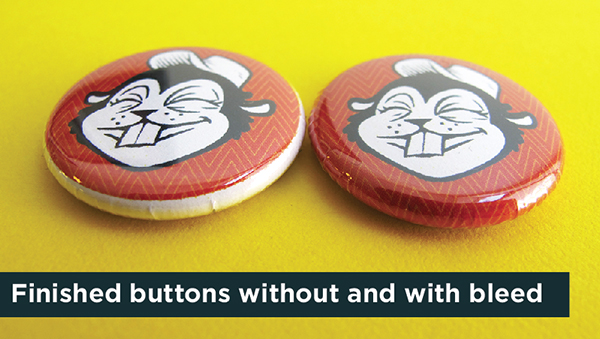
For best results: Add bleed using our button templates.
3. Let it Breathe
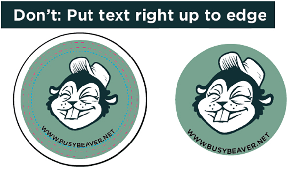
Creating your button design happens in 2-D space, but your finished button will come to you in real live 3-D, of course. While it may look cool to have artwork right up to the edge of the flat circle you're looking at on your computer screen, a button isn't a totally flat surface. Having text toward the edge where the buttons begins to curve around can make it tough to read. Natalie said, "Most designs look best when you allow a little breathing room and don't extend text all the way to the edge of the button face." Sure, it gives you a bit less space to work with but your eyes will thank you on the completed button. "Although there are exceptions to every rule, your average text-based button is most successful (and legible) when bold, clear text is placed on the face without completely reaching the edges."
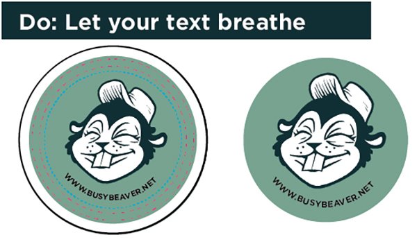
For best results: Give you text breathing room for maximum legibility.
Have other button layout questions? Email us at orders@busybeaver.net and we're happy to talk design tricks and even look over a button concept you're thinking about.
Honing your button design skills? Check out our full How To blog series.