

In addition to quick and quality service, Busy Beaver offers one of the widest varieties of custom button special finishes. The sparkle finish adds an amazing shine and glittery effect to all buttons and pins. To help make your future sparkle custom buttons look as great as they can, we've put together our top four tips for creating sparkle button pins.
1. Be Bold
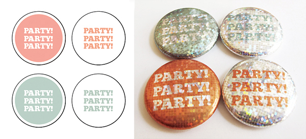
In our experiments with sparkle, we've found that bolder images work best. The designs below worked really well with graphic imagery— since black is opaque against the sparkle background, it really stands out against the glittery elements. When thinking about the images you want to use with sparkle, keep in mind that small details will tend to get lost against the holographic background. Make sure the important parts of your image are clear and bold.
![]()
Simple, bold imagery works well for sparkle buttons.
2. Pump Up the Contrast
This is a tip we discovered the hard way when testing out our own sparkle designs and you may want to keep in mind when you design your own pin. In the example image below, you can see the view of the files on screen and then printed for the pins—which is very similar to our metallic finish pins!
On screen the coral and aqua colors were somewhat pastel but definitely not hard difficult to read. When pressed as sparkle buttons, though, the background left the buttons nearly impossible to read in person, especially for the aqua buttons. The takeaway is that it's important to make sure that your image has plenty of contrast. Semi-transparent colors and tone on tone designs aren't going to work well for sparkle—stick with standard full color for those files.
Low contrast color combinations are tough to see on sparkle buttons.
3. Keep Text Simple
Similar to our cosmic finish, there's a whole lot of reflection happening on the background of a sparkle button. We think that this is what makes them awesome, but that amount of busyness can be a little tricky if you're making a text button.
If you need to include text in your sparkle design, make sure you keep the first two tips in mind: keep your text bold and high contrast. The image below illustrate that it is possible to get away with a script font, but in that case black may be your best bet. For sans-serif fonts, high contrast color combinations (like the red on yellow and navy on green examples) give the most legibility. In general, we'd suggest going with simple text in sans serif fonts and high contrast color combos for sparkle designs.
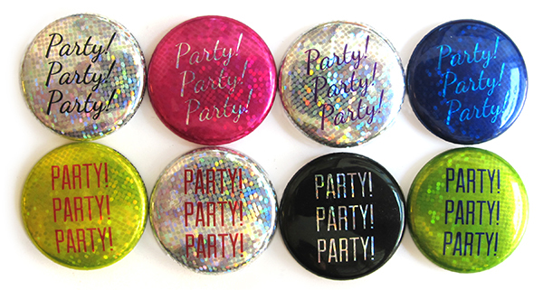
Simple text and high contrast color combinations are most legible on sparkle buttons.
4. Think Hard About Photos
If you're considering printing a photo using sparkle effect, think about how your image stacks up to the tips mentioned above. It is bold? Does it have strong contrast? Is it okay if the fine details get lost? Not every photo is going to be appropriate for a sparkle button but there are definitely examples in which sparkle adds really cool element. To illustrate the range of results you can get with sparkle photo buttons, we pulled together a variety of images from our favorite Tom Hanks movies (because why not?). In darker photos, sparkle doesn't add a lot (Forrest Gump ice cream scene), but it's visible in white backgrounds (Forrest Gump in bench) and makes colorful photos pop (Castaway). Close ups tend to work better since the details from longer-view images were tougher to distinguish with the addition of sparkle.
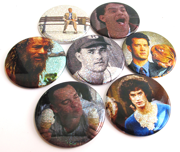
Sparkle effect combined with some of our favorite moments from Tom Hanks long and illustrious career.
Feeling confident that your design is ready to sparkle? Get started on your order here.